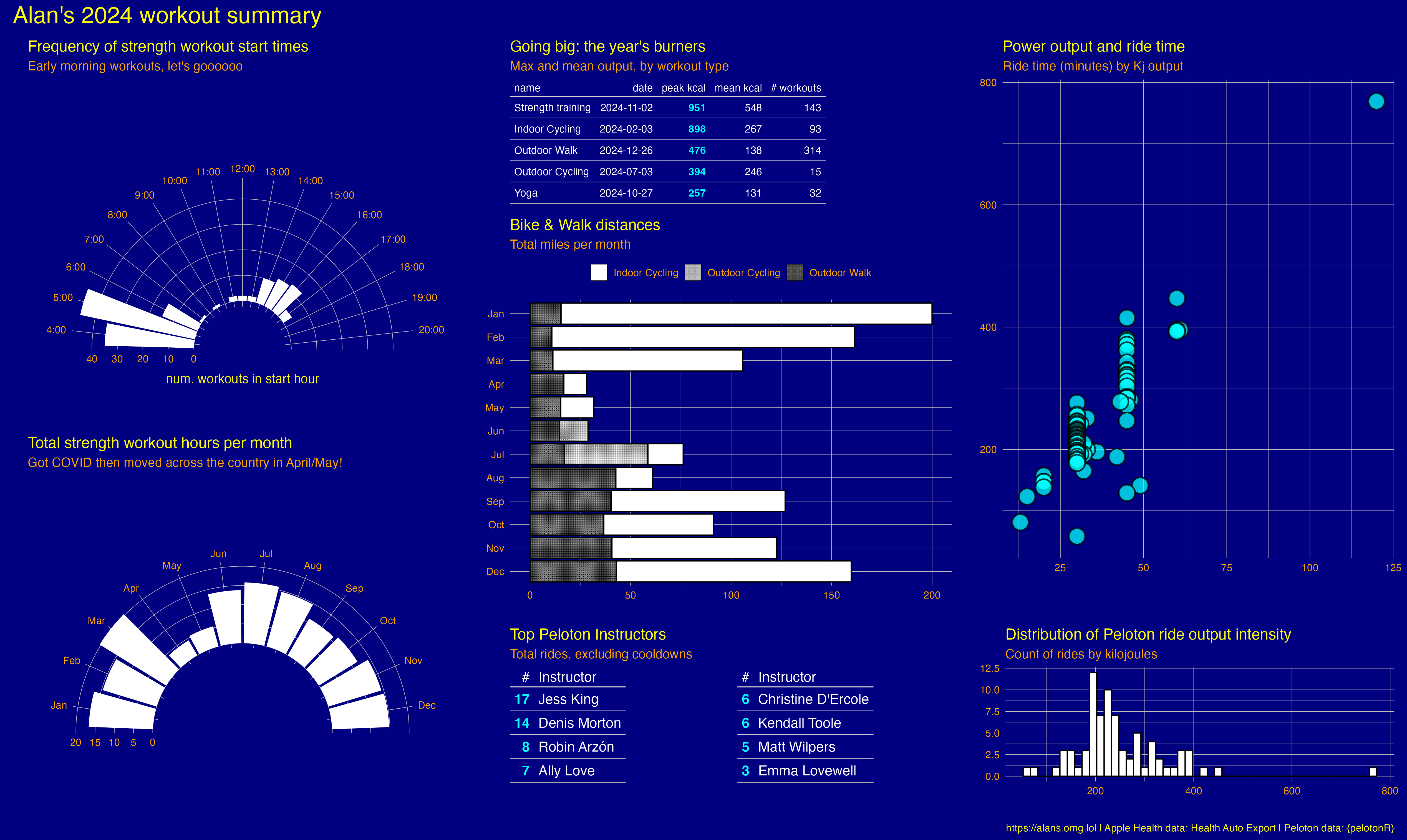
tl;dr: Here’s my 2024 workout summary!
I did okay as far as workouts go, this year. My injured ankle improved quite a bit, or at least bothered me less significantly less often, but there are some exercises I can’t do anymore, and I miss that. One can see that noticeably low span of April to May,1 and that’s where we unexpectedly up and moved – and in which I came down with Covid, too – which occupied a lot of my time that might have otherwise gone to … other things.
I also made a quick comparison against my 2023 data, but it wasn’t very interesting. My workout routine was pretty routine, turns out, though I did ride the indoor bike more in 2024. But this table of total indoor ride distance is a little misleading, because some of my 2023 rides were on a bike that didn’t give me distance metrics. So it’s probably safe to say that I racked up more distance, but not as much more in 2024 than this would suggest:
| year | count | distance |
|---|---|---|
| Indoor Cycling | ||
| 2023 | 80 | 432.8199 |
| 2024 | 93 | 808.9370 |
| Outdoor Walk | ||
| 2023 | 351 | 318.3844 |
| 2024 | 314 | 304.5579 |
making the summary
I had a good time gradually building up this summary image of my 2024 workout data.
I’m getting data from two sources:
- Peloton, via the {PelotonR} package.
- and Apple Health, via the Health Auto Export app.
working with the Peloton data
I’m using a fork of Laura Ellis’s fantastic {pelotonR}: I’ve made a couple of key changes to address issues introduced by new ride types on the Peloton side, and to provide some new conveniences, so this notebook relies on my own fork of the package:
pak::pak("ats/pelotonR")I use {keyring} to to store and retrieve sensitive information from the system’s confidential store. First, set your Peloton information. You only have to do this once and it will provide an interactive UI to store your password (in this case, using my MacOS keyring).
pak::pak("keyring")
keyring::key_set("pelotonR")
With that information stored, you can retrieve it any time, and use it with the authenticate function from {pelotonR}:
my_name <- "MY PELO USERNAME"
keyring::key_get("pelotonR")
resp <- authenticate(username=my_name,
  keyring::key_get("pelotonR"))
Now I can retrieve my data from Peloton. I’m specifying a page limit so that I don’t fetch every single page of my data right now. Using pages=10 will get up to 200 workout records. I landed on the parameter of 40 below with some trial and error – that got me to all my 2024 workouts.
workouts <- get_workouts_and_instructors_df(pages=40)

w <- workouts |>
  augment_peloton_df(tzone="America/Los_Angeles") |>
filter(year(start_time) == 2024)(augment_peloton_df is my own function, which does a bit of cleaning, adds a couple of summary fields and adjusts ride time to a uniform time zone)
w is now a great big data set of Peloton history for 2024 across all workout types recorded either with the mobile app or via the equipment (like my bike). With it you can do things like see which instructors you took the most rides with:
w |>
  filter(workout.name == "Cycling Workout" &
    !grepl("Cool Down", workout.peloton.ride.title) &
      workout.workout_type == "class") |>
  select(workout.name, instructor.name, workout.workout_type) |>
  summarise(`Total rides` = sum(n()),
    .by=c(workout.name, instructor.name, workout.workout_type)) |>
  arrange(desc(`Total rides`)) |>
  filter(`Total rides` > 1) |>
  # fix the removal of Kendall's name from records by
  #   adding it when a class has no instructor name
  mutate(Instructor =
    case_when(
      is.na(instructor.name) & workout.workout_type=="class" ~ "Kendall Toole",
      .default = instructor.name
    )
  ) |>
    select(`#` = `Total rides`, Instructor) |>
gt::gt()| # | Instructor |
|---|---|
| 17 | Jess King |
| 14 | Denis Morton |
| 8 | Robin Arzón |
| 7 | Ally Love |
| 6 | Christine D'Ercole |
| 6 | Kendall Toole |
| 5 | Matt Wilpers |
| 3 | Emma Lovewell |
| 2 | Olivia Amato |
Here’s something interesting about the data returned from that Peloton API call: It doesn’t provide any distance information, even though there’s a column for it.
w |> filter(workout.name=="Cycling Workout") |>
  summarise(total_workouts = n(),
    distance = sum(workout.peloton.ride.distance, na.rm=TRUE),
    .by = c(workout.name, workout.workout_type, workout.device_type)) |>
  arrange(desc(total_workouts)) |>
gt::gt()| workout.name | workout.workout_type | workout.device_type | total_workouts | distance |
|---|---|---|---|---|
| Cycling Workout | class | home_bike_plus | 101 | 0 |
| Cycling Workout | freestyle | iPhone | 12 | 0 |
| Cycling Workout | freestyle | home_bike_plus | 11 | 0 |
That’s kind of a bummer, but we consumers of an unofficial and tacitly public API can’t really complain.
I can get distance information and a bunch of other more detailed data from the Peloton API’s /performance_graph endpoint, one workout at a time. I mocked up a way to do that for any selected set of workouts from the w data set, such as for the first 10 records:
wpf <- tibble()
for (i in 1:10) {
  wid <- w[i]$workout.id
  call <- paste0("https://api.onepeloton.com/api/workout/", wid, "/performance_graph")
  req <- httr::GET(call)
  if (req$status_code != 200) {
    req$status_code
    break
  }
  workout_detail <- tibble(wid, rawToChar(req$content))
  names(workout_detail) <- c("wid", "content")
  wpf <- rbind(wpf, workout_detail)
  Sys.sleep(1) # be gentle on the API
}
This makes a tibble containing a big JSON string of the detailed per-workout information, which you can parse for heart rate, distance, and a bunch of other data (which is exactly what I do for RideShare).
This works great for one workout session at a time, or for a subset of the total, but I don’t want to get that data volume for this purpose. So at this point I pivot over to consider my data from Apple Health, instead.
working with data from Apple Health
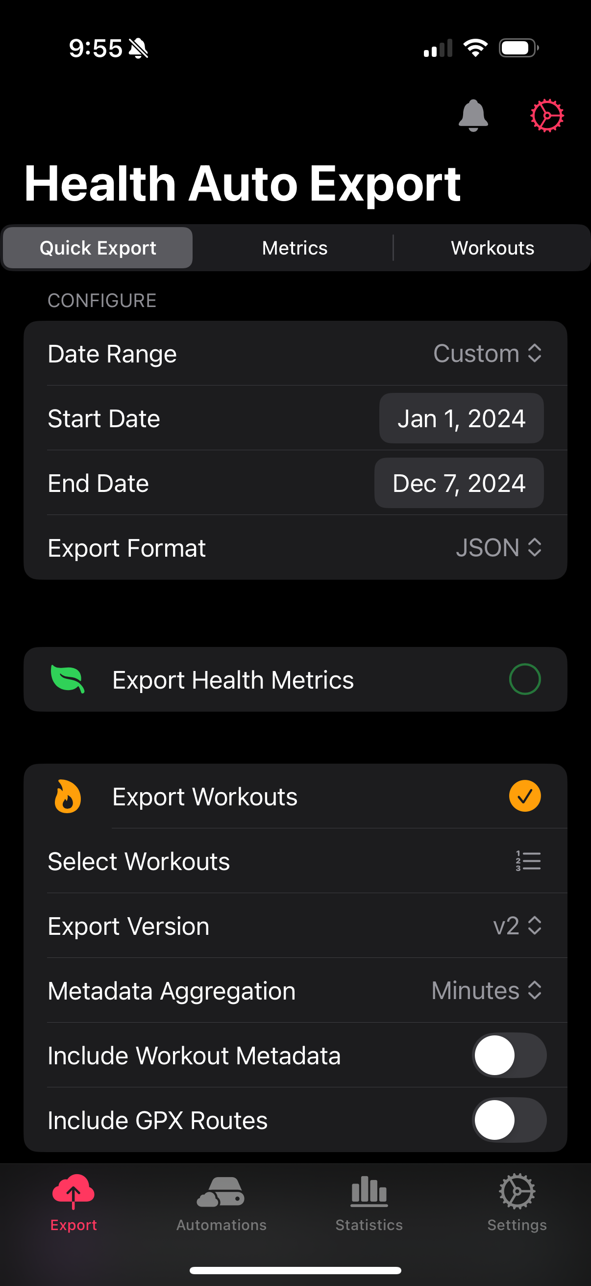
I use the Health Auto Export app to get my data out. This is a powerful and flexible app with a ton of options including automations to your own APIs. It’s very cool! I’m doing it one export at a time like a caveman. It’s fine.
Health Auto Export has a lot of options and trying to export a full year of all data tended to fail, so I select an export of only workouts for the date range I want. Running the app on my phone, I save the output file to a folder in iCloud Drive, which neatly syncs over to my Mac.
With the data exported, I can load it and use tidyjson to parse it into a tibble:
# load Auto Export Apple Health data
apple_health <-
  jsonlite::read_json("~/Library/Mobile Documents/iCloud~com~ifunography~HealthExport/Documents/HealthAutoExport-2024-01-01-2024-12-31.json")
h <- tidyjson::as_data_frame(apple_health)
health_spread <- h$data$workouts |> tidyjson::spread_all()
Now I can make some summary information for my strength workouts from that data. For example:
strength <- health_spread |>
  as_tibble() |>
  filter(grepl("Strength", name, fixed = TRUE)) |>
  mutate(month = month(start, label = TRUE, abbr = TRUE)) |>
  # fix the occasional workout that I forgot to turn off by
  #   setting its duration to something more reasonable
  mutate(
duration_fixed = case_when(
      duration > 7000 ~ 6000,
      .default = duration
    ))

strength |>
  summarise(workouts = sum(n()),
    duration_minutes = ceiling(sum(duration_fixed)/60),
    duration_hours = ceiling(sum(duration_fixed)/3600),
    .by=c(month)) |>
  arrange(month) |>
gt::gt()| month | workouts | duration_minutes | duration_hours |
|---|---|---|---|
| Jan | 13 | 1001 | 17 |
| Feb | 14 | 879 | 15 |
| Mar | 17 | 1219 | 21 |
| Apr | 5 | 268 | 5 |
| May | 5 | 323 | 6 |
| Jun | 12 | 827 | 14 |
| Jul | 14 | 947 | 16 |
| Aug | 14 | 883 | 15 |
| Sep | 11 | 663 | 12 |
| Oct | 11 | 708 | 12 |
| Nov | 14 | 863 | 15 |
| Dec | 13 | 889 | 15 |
putting it together
From here I basically have the data I need, and it’s a matter of exploring it to find the attributes I want to understand and describe. The two elements of this presentation where I learned a bunch of new tools come from using {gt} and {patchwork}.
A gt table can optionally highlight a specific set of columns to call out results. Styling gt tables is done with a function that the table is piped into, so I made a style function that lets me specify an arbitrary column to give additional focus to. It also sets the basic color elements so that all my tables in the plot are consistent.
gt_theme_transparent <- function(data, focus=NULL) {
data |>
    tab_options(
      table.background.color = "transparent",
      table.font.color = "navy",
      table.border.top.width = 0,
    ) |>
      tab_style(
        style = cell_text(color = "orange",
          weight = "bold"),
        locations = cells_body(
        columns = focus
    ))
}
I can then pass that function into a gt table, and the column I specify with the focus field will be highlighted:
health_spread |>
  group_by(name) |>
  summarise(total = n()) |>
  gt() |>
gt_theme_transparent(focus="total")| name | total |
|---|---|
| Functional Strength Training | 115 |
| Indoor Cycling | 130 |
| Mind and Body | 9 |
| Other | 2 |
| Outdoor Cycling | 15 |
| Outdoor Walk | 314 |
| Preparation and Recovery | 24 |
| Snow Sports | 1 |
| Traditional Strength Training | 28 |
| Yoga | 32 |
Finally, the patchwork package provides functionality to build a composite set of plots and tables. For its layout, Patchwork uses a character-based ‘map’ in which letters correspond both to relative position and size within the layout, and to the order in which each object is called in the composition. My patchwork code looks something like this.
layout <- "
AACCGG
AADDGG
BBDDGG
BBEFHH
"

workouts_by_hour +      # A
  workouts_by_month +   # B
  peak_workouts +       # C <-- this is a gt object
    ggtitle("Title for a gt object placed with patchwork",
      subtitle="gt object subtitle") +
  distances +           # D
  instructors_1 +       # E
  instructors_2 +       # F
  power_time +          # G
  power_distribution +  # H
  plot_layout(design = layout) +
    # below layout is applied to the entire patchwork
    plot_annotation(
      title="Alan's 2024 workout summary",
      caption = "https://alans.omg.lol | Apple Health data: Health Auto Export | Peloton data: {pelotonR}",
      theme=theme(plot.title=element_text(size=20, color="yellow"),
        text=element_text(color="yellow"))
      ) &
        theme(plot.background=element_rect(color_plot_background, linetype="blank"),
          plot.title=element_text(color=color_title),
          plot.subtitle=element_text(color=color_subtitle),
          panel.grid = element_line(color=color_grid, linewidth=.2),
          axis.text = element_text(color=color_axis),
          axis.title = element_text(color=color_title),
          strip.background=element_rect(color=color_strip_background, fill="transparent"),
          strip.text = element_text(color=color_strip_background)
        )
Objects built with gt can be placed by patchwork, and title and caption elements can be added as part of the layout. These gt objects don’t afford quite as much flexibility2, so getting things right took some experimentation.
I built all of my ggplot and gt objects, and then arranged them with patchwork to make the final image. Once again:
And that’s it! Those are the nuts and bolts of making something out of my 2024 workout data and learning some new tricks along the way.

